The Value of the Tangible Image

As discussed in my previous post, we all tend to find more value in rare and unique things that are not available to the masses. An object or finding like this can often make us feel just as unique for possessing it or even just knowing about it. This can be transferred into anything, for example, music, film and photography.
Since the invention of photography, the final outcome of each image has been a very tangible object. Only recently has technology developed so much that this is no longer the case, with the invention of the digital camera and high-resolution screens. At one time, a family photograph was such a rare occurrence that it would be seen as an occasion when everyone would wear their best clothes.

old_bw_f

These days it just takes one click and seconds, the image appears on the camera screen. This development in technology has proven extremely  advantageous to many aspects of the modern world such as media and editorial work, but it seems that it may be taking value away from things that should really be looked after and cherished. Cameras are on so many devices now that it would seem silly for us not to take a photograph of something of interest. Yet in reality, the camera acts as a barrier between the situation and our curiosity. We tell ourselves that we’ll look at the image later, but we usually never do and instead of enjoying the moment and absorbing ourselves in what the camera observes, we distance ourselves from it and miss out on a lot of what is really going on around us.

Similarly to written books, physical photo albums are becoming less popular. We are now creating online photo albums on social media sites and publishing them for our ‘friends’ to see, but very rarely view the image on anything but a screen. As quickly as has been taken, an image can be deleted, without any wastage of film or memory. So many images are being taken now, that sometimes we even forget when or where the picture was taken. Doesn’t that defeat the purpose of it all? We have moved so far away from the original invention of photography that it may be more appropriate to describe it as ‘social media content’ instead. Photographs are of such little worth now, that they have become as disposable as any other mass-produced thing. Apps like ‘Snapchat’ for example, are designed to show an image for only a few seconds and then disappear again. The difference however, is that these shouldn’t be just like any other mass-produced thing. Every photograph that is taken by you has a personal link, whether it be of a person, place or occasion. If you took it, you will have been there.
 It seems a shame that images like this can be shared so publicly, and often with people who don’t necessarily know you very well. Just as mass production allows for mass distribution, digital photography and social media sites also allow for mass distribution. Through the process of distribution of personal photographs, they lose some of their worth which can cheapen these memories. Would it not be best for us to return to the tangible image for personal events and memories, leave the mass-produced image to the mass media, and therefore define the line between what is public and what is personal in order to keep all value of our memories.

Snapchat Logo

(Ideas adapted from lectures by Donna Leishman and Chris Byrne)

Mass Production Vs. The Handmade Object

In a world of mass production, the value of objects has drastically declined. The Uk was once a nation that boiled chicken bones to make stock for soup, and darned socks at least twice before there was any thought of throwing them away, but has now become a nation that wastes 7 million tonnes of food a year, and throws out clothing as if they were Kleenex. During the first and second World Wars, families had to ration their food and they would value their possessions. Hand-me-downs would be gratefully accepted and cherished instead of dismissed for something new and exciting. This disposable mindset has taken over throughout the past few decades, but the question is, is mass production to blame?sugar ration

The word ‘craft’ barely exists anymore, at least not in its original form. In past years, great care would have been taken to ensure that every object was made to a high standard and made to last. Before machinery was capable of cutting precise lines and clean edges, a great pride would have been taken to manually produce objects and household items which meant that every object was unique and individual. Although mass production has allowed for more objects to be made faster, it has taken away their worth as objects in themselves. The value of something automatically decreases when more than one is made available. So when hundreds, thousands or tens of thousands of that object is made, then the value drops significantly, not only in price, but in Peoples mentality. For example, if a friend is wearing a coat that you really like, you may ask them where they bought it from, but when they tell you that it was their grandmothers from the 1920’s, the value of it for you, even subconsciously will increase significantly. Humans, from a very early age have an instinctual mindset to challenge themselves to get what they want but can’t have. So when something is made easily available to someone and is very cheap to buy, the lack of challenge when acquiring that object therefore leads to lack of value for it. Siblings Fighting over Hamburger

Objects that are produced in bulk tend to lack in quality. In the beginning they tended to serve only as a function but over years have there has been a push to design for function as well as aesthetics. In 1919, German architect Walter Gropius founded a school called the Bauhaus for the work of both visual artists and designers to combine. His main aim was to inject the beauty of the arts into the function of design. Throughout this process many practices were combined and discoveries made, a lot of  which are still in use today. The fundamental practices of many art schools even now are based on those of the Bauhaus school. This shows the importance of creating designs that combine these aspects, and hopefully in doing so will encourage more and more people to take pride in their possessions.

BauhausCabinet

Bauhaus Cabinet

References:

Lectures by Chris Byrne

http://england.lovefoodhatewaste.com/node/2472

http://www.metmuseum.org/toah/hd/bauh/hd_bauh.htm

To Flee or Not to Flee?

During the time of Nazi power, Hitlers distaste for modernist art led for him to target specific artists and  who did not conform to his beliefs of what art should look like or portray. Artists work had to be approved by the government and invited to join the Reich Chamber of Culture, but if their work was too satirical or modernist, they were prohibited from buying materials in order to paint, from teaching, and  from exhibiting any of their works. Other artists or designers who the Nazi party approved of were asked to work for them to further publicise their campaigns. If the government didn’t approve of the work that an artists was producing, they had only three options. Either accept that they had to conform the Nazi conditions, prepare for a life that did not involve producing any artwork, or flee the country. As you can imagine, all three of these options would be very difficult to succumb to. Many great artists such as Paul Klee, Wassily Kandinsky and George Grosz fled to places such as Switzerland, Paris and America where their work continued to prove very influential to the modernist movement.

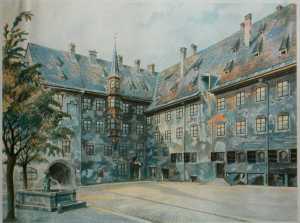
hitler art

A piece painted by Adolf Hitler that reflected his non-modernist  tastes.

Many people, myself included, have great respect for these artists. They gave up their whole lives, families, friends and homes in order to preserve their integrity and not bow down to Hitlers small-minded tastes. It is greatly inspirational that these artists, including many others, stood by what they believed in and managed to shake the grasp that the Nazi government held. Left with so few options, this must have proved one of the most difficult decisions to face. It makes you wonder, what if Hitler had allowed for these artists to continue their careers in Germany? How many works of artists did he suppress that could have proved extremely inspirational and important to future movements? And how different would history have been if Hitler had first succeeded as an artist himself?

References:

Lectures By Donna Leishman

http://www.historylearningsite.co.uk/art_nazi_germany.htm

Nazi Power and Culture Control

Previous to becoming a politician, Adolf Hitlers dream was to be an artist. After being refused twice from art school for being too architectural in style, he turned to politics and when the Nazi party came into power after the first world war, no one could have expected what was to follow. The controlling nature of Hitler and his party seeped its way into culture and the arts as they tried to brainwash the public into appreciating only traditional and romantic art styles and disregarding all other new and modern art which they named ‘Degenerate’. In order to try to influence the publics opinion of these modern and abstract works, Hitler arranged for two exhibitions of artwork, one of what he perceived as ‘good’ art and one of ‘degenerate’ art. He was very disrespectful to the artists and work of the modern movements as he wanted to portray them as unprofessional. He did so by ordering them to be arranged badly on the wall and be accompanied by handwritten information signs. A room that consisted of only abstract art was named  “The Insanity Room”, amongst other suggestions of biased views. The summer before the exhibition, Hitler Stated “Works of art which cannot be understood in themselves but need some pretentious instruction book to justify their existence will never again find their way to the German people”.
The artworks that Hitler approved of were predominantly paintings that were seen as more traditional in subject and style. These were hung on the gallery walls professionally and neatly, to show that they should be respected and appreciated. This intention to culturally control the public backfired significantly when the ‘Degenerate’ art exhibition was far more popular than the one of classical art.

Queues that filled the streets for the 'Degenerate' art exhibition in 1937

Queues that filled the streets for the ‘Degenerate’ art exhibition in 1937

Throughout the years of 1937 and 1938, Hitlers attempts to culturally cleanse Germany continued when over 16,000 artworks of ‘Degenerate Art’ were removed from German Museums. Artworks were burned, sold for very little or kept to simply ridicule and ‘educate’ Germany as to what was commendable art and what wasn’t. Throughout years since then, many pieces that were seized or sold have been uncovered, the most recent, in Munich which were being hidden in the flat of Cornelius Gurlitt. Gurlitts father was an art collector for Hitler and had collected over 1,500 works by artists such as Pablo Picasso, Henri Matisse and Paul Klee. Cornelius Gurlitt, now an 80-year-old man, had kept this stash a secret for many years, and when he needed money, would sell some of the lesser known paintings in order to avoid publicity. Discoveries like this prove invaluable to current artists, art critics and art enthusiasts to further their understandings of some of the greatest works of the modernist movement. It is hopeful that more discoveries like this will occur in future years but it is unlikely that we will ever know if all paintings will be recovered.

picaassos Guernica

Replica of Picasso’s ‘Guernica’ found in Munich Stash

References:

Lectures by Donna Leishman

http://www.bbc.co.uk/news/magazine-24819441

http://www.bbc.co.uk/news/world-europe-24794970

http://www.historylearningsite.co.uk/art_nazi_germany.htm

Dadaism- An art movement? Or a joke?

In the early 1900’s  the concept of controversy was taken to extremes with a movement known as ‘Dadaism’. However, instead of being ‘inappropriate’ due to aspects such as nudity, Dadaists would use humour and ridicule as a protest against WWI in a satirical manner. Their argument demonstrated that they felt that the war was ridiculous and irrational and therefore produced art that rebelled against all rules of art that had previously been made. The whole point of the Dada movement was to be pointless, to have no reason, which emulated their thoughts on the war. The question “what is art?” was deliberated over. Are everyday objects art if they are place in an artistic context? Marcel Duchamp explored this question when he exhibited his ‘ready-made’ artworks, one of which was, simply put, a urinal on a plinth, named ‘Fountain’. This is a prime example of the mockery that Dadaists set out to portray. It suggests that the War was so ridiculous that the art that they produce is normal in such a world.

Duchamp_Fountaine

Marcel Duchamp ‘Fountain’

“I have forced myself to contradict myself in order to avoid conforming to my own taste.”

― Marcel Duchamp

The film below explores the question “what is art?”. It looks at how ridiculous some art pieces can be, similarly to the Dada artists. However, it does show that this movement of the early 1900’s has had a significant effect on the contemporary art of today:

References:

Lectures by Donna Leisman

http://arthistory.about.com/cs/arthistory10one/a/dada.htm

http://www.understandingduchamp.com/

http://www.goodreads.com/quotes/search?utf8=%E2%9C%93&q=duchamp&commit=Search

Pushing the Boundaries – Avant-Garde

In a world that is constantly moving forward, it is inevitable that the art of the world will do so also. One of the key turning points in art history was around the 1870’s when ‘Avant-garde’ art was established. This was a controversial movement at the time as it tried to contradict traditional artworks in a facetious manner. The urge to produce pieces that would shock its audience was a main aim in this era for some artists. Some works were so controversial that the Salon de Paris refused to show them. One example of this is Edouard Manet’s ‘Le Dejeuner Sur L’herbe’.

Edouard Manet "Le Dejeuner Sur L'herbe"

Edouard Manet “Le Dejeuner Sur L’herbe”

If we were to view this piece for the first time now, we would have a completely different view than what was of the past. Art critics of the Salon found it far to controversial, the barrier between ‘nude’ and ‘naked’ had been broken. The woman in this piece is not posed in the glorified position of a Goddess but instead looks directly at the audience, making it clear that she is aware that she is being looked at and is not perturbed by that fact. The objects surrounding her are not staged, but instead are strewn around, accompanied by fruit falling out of the picnic basket and a blanket coiled  around her ankle. Although this was a controversial piece of the late 1800’s and some art critics of the time very much disapproved of it, we must appreciate the fact that without pieces like this, art would not be the same as it is today. This act of breaking societal norms within the era have inspired so many artists since. The boundaries of art are constantly being pushed further and further to provoke thought and reaction. So when we hear of a man publicly nailing his scrotum to a cobbled street in Moscow as ‘a metaphor for the apathy in Russia’, some may  be shocked and appalled now, but who knows, future generations of artists may relish in the effects of such a piece.

References:

Lectures by Donna Leishman

http://www.bbc.co.uk/news/world-europe-24896784

http://www.citrinitas.com/history_of_viscom/avantgarde.html

Fairytale Origins- Little Red Riding Hood

We all know the story of  Little Red Riding Hood, usually Charles Perrault’s version, as little girl who ventures to visit her grandmother who lives in the woods, but is tricked and eaten by a wolf. The moral of the story being, don’t talk to strangers. However, some of the original versions are far darker, and not quite as suitable for younger audiences. Here is  a link to one of the earlier version of this tale:

http://www.sjsu.edu/faculty/harris/StudentProjects/Student_FairyTales/WebProject/Fairy%20Tales/The%20Story%20of%20Grandmother.htm

There are many ways of analysing this story and breaking down its symbolism, however, after looking at the story myself, I found  that it could be taken as a metaphor for the process of coping with death. A young girl experiencing death of a loved one for the first time and how she deals with it.
She arrives at her grandmothers house to find her dead, obviously a frightening experience for anyone, let alone a young child, so death is portrayed as a wolf which has always been a symbol for something frightening. The eating of her grandmothers flesh and blood symbolises her taking in the fact that her grandmother is dead, processing what has happened. When the wolf tells her to get into the bed and take off her clothes, it could be seen as a metaphor for death taking control of the girl, as it takes control of many people when they experience a loved one dying.  She questions the wolf, the eyes, the ears etc, a symbol for her taking some control, questioning what death really is and realising that it does not have control over her. In the end, she manages to escape from the wolf and therefore, for this symbolic interpretation, she manages to escape the grasps that grief can hold. The moral of the story – Don’t let grief take over or control your life.

Many people would disagree on the points that I have made above. However, a story is only as understood as it is perceived and different people perceive things in different ways. This therefore further explains one reason why storytelling has changed so much over the years, it doesn’t just matter how it is told, the way in which it is heard is just as, if not even more important.

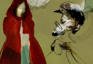
Little Red Riding Hood Illustration By Daniel Egneus

Little Red Riding Hood Illustration By Daniel Egneus

(Ideas adapted from lectures by Donna Leishman)

Fairytale Origins

From the beginning of our existence we, as humans, have been storytellers. From images on cave walls, to oral tales, literature, and now in the form of photography  and film. Humans are social animals and we express ourselves through these mediums in order to further our sociability. Just like the form of storytelling has changed over the years, the details of stories have also changed. If you imagine it like a game of Chinese whispers: stories that have been told by word of mouth and are changed slightly from person to person and can end up being a completely abstracted or elaborated version of previous ones.

“There is never a single orthodox version of a myth. As our circumstances change, we need to tell our stories differently in order to bring out their timeless truth.” – Karen Armstrong

The extent to which stories are adapted is incredible look at. For example, you may be surprised to hear some far more gruesome versions of what we know from our childhoods of beloved fairy tales or Disney adaptations. A Little Red Riding Hood who ate her Grandmother and was called a slut by a cat, two horrible step sisters who cut off parts of their feet to fit into a glass slipper and have their eyes pecked our by pigeons, and  a Rumpelstiltskin who decided to rip himself in two after being shown up as a fool!  Whether it be adapted by the famous Charles Perrault or the Grimm Brothers, those individual seeds that were planted as the initial ideas to  demonstrate morals and values have branched out into different directions significantly over time.

Visual Narrative 6

References:

Lectures by Donna Leishman

Karen Armstrong (2004). A short history of myth. London: Canongate. Introductory pages

http://listverse.com/2009/01/06/9-gruesome-fairy-tale-origins/

The Importance of Good Typography

We’ve all heard the saying “Don’t judge a book by its cover”, and whilst we all try not to, it is human nature to make a quick judgement on the first appearance of something. So when designing a concert poster, book cover, advertisement etc. it is very important that we ensure the first impression of the subject is the best we can make it.
Within communication design, it is imperative that when type is being adopted, it is used in the correct way. Contemporary typography can be divided into two separate groups. The first deals with designs that require an informative and almost sterile style that is often used for advertising, poster design or book covers, where it is very important that the text is legible to communicate the ideas and information. This is created in a precise, and some may say more graphic approach, often using computer software. The other group takes a more lax approach to legibility and is designed to provide an emotive portrayal, often far more illustrative in appearance not necessarily required to be legible.
Good design comes down to good typography. A design can be ruined simply by bad placing, scale or choice of type to what would otherwise be a successful design. These aspects including others such as weight and colour can completely change a message or emphasis on a subject. Below are two simple mock ups that I created of a hypothetical instance where type can completely change a design/image, for better or worse.

Example of Bad Typography

Example of Bad Typography

Example of Good Typography

Example of Good Typography

As you can see above, the first image is an example of terrible placing, colour, scale and choice of type.  To begin with, the title reads “The Big Book of Patrick Hook” rather than “The Big Book of Birds” and the word “Birds” is left to the side by itself. This may seem like a very fundamental mistake to make and I have deliberately exaggerated this in my example but it might surprise you how often this kind of situation occurs in real life design which therefore affects the accuracy of information. In the example of good typography the title and author are separated to ensure a clear division between the two. The placing of the typography also leads the eyes diagonally across the page from the top left to bottom right corners which encourages the audience to take in all aspects of the book cover rather than focussing on just one section. The colours of the first piece are appalling; they completely clash with one another, are too brash and blend in far too much to the background image. When creating designs for an informative purpose, the designer must ensure that all words are legible and furthermore, are read in the manner intended. In the second image I have used a far more subtle dark grey which isn’t as harsh as black, yet is dark enough to stand out within the design. This ensures the book design stays elegant and sophisticated, which therefore will appeal to the appropriate market. Lastly, the typefaces used do not work well together at all in the first image. Contemporary typography often shows us that different styles of type can work very well together on the same page, however there is a skill within this that must be employed. Type must never be thrown onto a page and be expected to look good, it should always be thought through carefully and planned out.

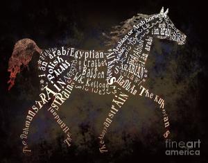
the-arabian-horse-in-typography-ginny-luttrell

Illustrative Typography

Above is an example of a more illustrative approach to typography. As explained previously, not all words need to be properly understood but instead the focus is on the image as a whole, in the above case, a horse. This kind of typography tends to be far more visually appealing and interesting in composition and is often created this way to cleverly convey a message. In this particular image, some of the words are upside down, and in obscure positions but are done so to create a convincing silhouette of the horse. Through my own research and experience, I have found that creating this more illustrative style of typography can often be far more interesting and rewarding, however depending on the brief/project it is not always appropriate. A good designer will not choose the best design for their boss, nor for the art critics of the world, or for themselves, but instead for the audience that it is ultimately intended for.

References:

Lectures By Donna Leishman

Hellar, D & Talarico, L (2012). Typography Sketchbooks. London: Thames and Hudson. Introduction.

Typeface History at a Glance

Typography : The art or procedure of arranging type or processing data and printing from it. – Oxford Dictionary.

The first modern-day form of typography came to the public by German blacksmith Johannes Gutenberg in the Mid 1400’s with the invention of the first movable type printing press. As this wonderful invention became available within other areas of Europe and further afield, typeface styles began to evolve more than ever. Over the past few centuries, the typographic limelight has hopped from country to country. The majority of important typefaces originated in European Countries with help from America now and again, mainly for use in journalism, education and advertising. Luckily for us, Gutenberg’s invention encouraged a snowball effect in typeface design to allow for a plethora of fonts that are still in use today. Thanks to Max Miedinger of Switzerland, in 1957 we were granted the use of Helvetica, the default font for computers. Stanley Morison of London gifted us with Times Roman in 1932, the first type used in newspapers and Eric Gill, with Gill Sans, originally Commissioned for London Railway in 1928.

periodicTableType

These typographic designs that are easily readable and far less time-consuming to produce than original handwritten scripts have  allowed for a great development in communication, be it in literature, education or journalism. Some may see this development as pointless, and that one clear typeface would do, rather than the 90,000+ typefaces that are in use today. However, without the choice of these, the portrayal and expression of ideas would be nowhere near as impactful and of course, nowhere near as exciting.

For a more detailed explanation of the origins of typography, take a look as this. Graphic designer Ben Barrett-Forrest turns the history of type into an enthralling stop motion animation.

References:

Lectures by Donna Leishman

http://designinstruct.com/roundups/10-infographics-that-will-teach-you-about-typography/