We’ve all heard the saying “Don’t judge a book by its cover”, and whilst we all try not to, it is human nature to make a quick judgement on the first appearance of something. So when designing a concert poster, book cover, advertisement etc. it is very important that we ensure the first impression of the subject is the best we can make it.
Within communication design, it is imperative that when type is being adopted, it is used in the correct way. Contemporary typography can be divided into two separate groups. The first deals with designs that require an informative and almost sterile style that is often used for advertising, poster design or book covers, where it is very important that the text is legible to communicate the ideas and information. This is created in a precise, and some may say more graphic approach, often using computer software. The other group takes a more lax approach to legibility and is designed to provide an emotive portrayal, often far more illustrative in appearance not necessarily required to be legible.
Good design comes down to good typography. A design can be ruined simply by bad placing, scale or choice of type to what would otherwise be a successful design. These aspects including others such as weight and colour can completely change a message or emphasis on a subject. Below are two simple mock ups that I created of a hypothetical instance where type can completely change a design/image, for better or worse.

Example of Bad Typography

Example of Good Typography
As you can see above, the first image is an example of terrible placing, colour, scale and choice of type. To begin with, the title reads “The Big Book of Patrick Hook” rather than “The Big Book of Birds” and the word “Birds” is left to the side by itself. This may seem like a very fundamental mistake to make and I have deliberately exaggerated this in my example but it might surprise you how often this kind of situation occurs in real life design which therefore affects the accuracy of information. In the example of good typography the title and author are separated to ensure a clear division between the two. The placing of the typography also leads the eyes diagonally across the page from the top left to bottom right corners which encourages the audience to take in all aspects of the book cover rather than focussing on just one section. The colours of the first piece are appalling; they completely clash with one another, are too brash and blend in far too much to the background image. When creating designs for an informative purpose, the designer must ensure that all words are legible and furthermore, are read in the manner intended. In the second image I have used a far more subtle dark grey which isn’t as harsh as black, yet is dark enough to stand out within the design. This ensures the book design stays elegant and sophisticated, which therefore will appeal to the appropriate market. Lastly, the typefaces used do not work well together at all in the first image. Contemporary typography often shows us that different styles of type can work very well together on the same page, however there is a skill within this that must be employed. Type must never be thrown onto a page and be expected to look good, it should always be thought through carefully and planned out.
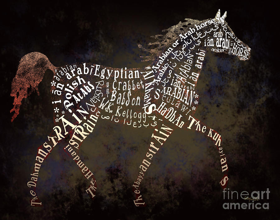
Illustrative Typography
Above is an example of a more illustrative approach to typography. As explained previously, not all words need to be properly understood but instead the focus is on the image as a whole, in the above case, a horse. This kind of typography tends to be far more visually appealing and interesting in composition and is often created this way to cleverly convey a message. In this particular image, some of the words are upside down, and in obscure positions but are done so to create a convincing silhouette of the horse. Through my own research and experience, I have found that creating this more illustrative style of typography can often be far more interesting and rewarding, however depending on the brief/project it is not always appropriate. A good designer will not choose the best design for their boss, nor for the art critics of the world, or for themselves, but instead for the audience that it is ultimately intended for.
References:
Lectures By Donna Leishman
Hellar, D & Talarico, L (2012). Typography Sketchbooks. London: Thames and Hudson. Introduction.